MAJOR CINEPLEX

Movies are a big part of the entertainment industry, and their websites have become increasingly critical to their overall success. Moviegoers now enjoys the convenience of booking electronic tickets through the cinema's official site. Major Cineplex, a local cinema chain in Bangkok, could greatly benefit from UX and UI improvements to provide better booking experience on their site.

deliverable

Responsive Webapp (redesign)

SKILLS & RESPONSIBILITY

UX Design, UI Design, Brand Identity

TOOLS & SOFTWARES

Axure, Sketch, Invision
THE CHALLENGE
rEDESIGNING AN INFORMATION-DENSE SITE TO FACILITATE BOOKING PROCESS
The current Major Cineplex site is packed with information that distracts users from the booking experience. The challenge was to delivered the right information to user at the right time, with the primary goals of facilitating the booking process and improving user's experience with the site.
(This is an unsolicited re-design project as PARt OF my DESIGN APPrentiCESHIp at BLOC)
USER RESEARCH
Findings and Goals
1. Approximately 70% of consumers make purchases through their smartphone. Thus, it is crucial for booking experience to work well on smart-phone screens.

2.Price of the ticket is only revealed far down into the flow, causing the users to repeat the search flow all over again.

3.Site architecture is unclear and doesn't offer a clear and intuitive navigation.

4.Electronic ticket issued on desktop site cannot be sent to smart phones for easy access at the cinema.
INFORMATION ARCHITECTURE
SITE MAP OVERVIEW
Currently, the navigation bar contains various menus and sub-menus. It is important to establish a new menu hierarchy so that booking is more prominent. Secondary to the booking are 'login' and 'movie list'.
USER FLOW
USER BOOKING flow
The flow of booking a movie ticket is very much like e-commerce. Users start with browsing or searching, then more information about the product is revealed. However, the difference lies in the showtime result page, where users is required to perform various filters and selection before the order is considered completed.
SITE FLOW
MOBILE-FIRST APPROACH TO RESPONSIVE DESIGN
Within Axure, I did a hybrid diagram that is a cross between a sitemap and a user journey. It can be considered as a very early phrase of a wireframe. The focus here is less on the screen constraints but more on user's action and touchpoints. Every module is designed from a mobile-first perspective, making sure that items would be easy to rearrange later on.
RESPONSIVE WIREFRAME
1.HOMEPAGE
I used the "Adaptive View", a relatively new feature of Axure, to create these finalized wireframes that is responsive to mobile, tablet and desktop screens. There are 5 keys screens, starting from the homepage below:
RESPONSIVE WIREFRAME
2.MOVIE INFORMATION
The movie info page starts with a big hero image taken from the movie. The overlay actions on the hero include an option to view trailer and adding the movie to the watchlist. More information is revealed as users scroll further down the page. The bottom of the page links to other movies.
RESPONSIVE WIREFRAME
3.SHOWTIME RESULTS
The current site displays movie listing under 'theatre number' which results in a very long and confusing page. I proposed to consolidate all the showtimes from all theatres as long as they belong to the same movie and location. A new feature is the 'filter' button that users can filter by price, seat types, and system types that will filter out irrelevant showtimes.
RESPONSIVE WIREFRAME
4.CHOOSE SEATS
Choosing seats must work well on all screens. As for the mobile-first approach, I made sure that the seat selector works even on the smallest screen size. Then for tablet and desktop views, the sidebar can be used for something beneficial such as displaying movie or theater image.
RESPONSIVE WIREFRAME
5.CHECKOUT
The wireframe below shows how a user can check-out as a guest. Like the current site, the only information required is their email. Users have the option to pay with a credit-card or other e-payment methods. After the transaction is completed, user is prompted with the option to register and save their information for a faster booking next time.
BRANDING DESIGN
PRESTIGIOUS AND ENERGETIC BRAND
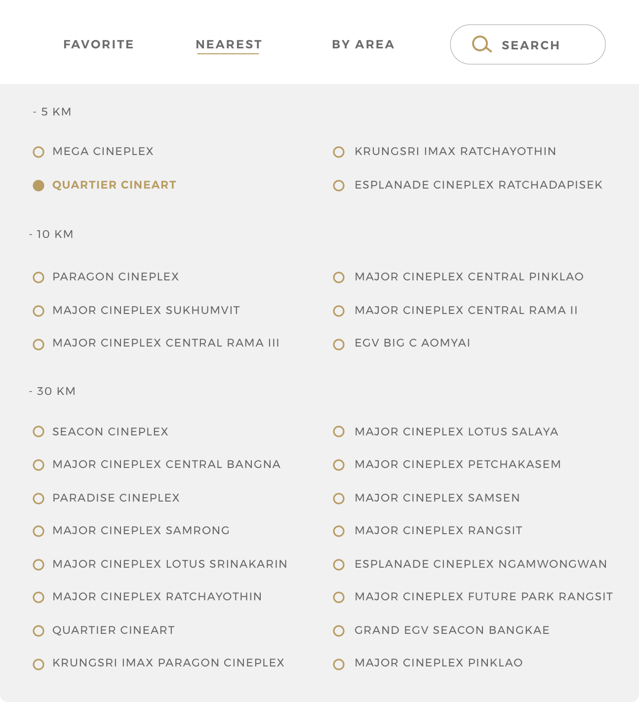
I looked at brands that use gold and black to set it apart as a premium brand. I took reference from various interfaces, prints and packaging design.
(This is an unsolicited re-design project as PARt OF my DESIGN APPrentiCESHIp at BLOC)
DESKTOP SCREENS
1.HOMEPAGE
DESKTOP SCREEN
2.MOVIE INFORMATION
DESKTOP SCREEN
3.SHOWTIME RESULTs
DESKTOP SCREEN
4.Choose seats
DESKTOP SCREEN
5.Checkout
Users can browse for ice-cream truck via list or map view. Users can also search for specific truck or ice-cream name. The filter button is readily available via an overlay button on top. When a search doesn't yield any result, the app displays an error message, keeping with the delightful theme.
UI STYLE GUIDE